Written by

Sarah Zeng
Marketing Coordinator
9 Jan, 2026
Services used
Image creation and videos execution
Percentage of COST saved
~ 50%
Percentage of time saved
~ 70%
Title
Revel was never designed to live in a game room. It was designed to sit comfortably alongside sofas, dining tables, and quiet moments at home.
Harrows approaches design with restraint. Even its most playful pieces are built to live comfortably within the home, not dominate it. The Revel table tennis table is a clear example, designed as a piece of furniture first, with proportion, material, and form considered so it can sit naturally in a living space rather than announce itself as a game.
The lifestyle imagery extends that thinking. Instead of turning the product into a statement prop, the visuals reinforce what the design already does well, showing how play can exist quietly alongside everyday living. By placing Revel in real-feeling interiors, the imagery strengthens its core idea: a table that invites moments of fun, without asking the room to revolve around it.


The Challenge
Multi-purpose pieces are often shown one way: Products designed to do more than one thing are usually presented from a single angle, making them feel less natural in everyday home settings.
Furniture buyers need reassurance, not spectacle: High-involvement purchases require a sense of fit, scale, and calm before excitement.
White backgrounds exaggerate “equipment” over design: Isolated shots flatten context and amplify the feeling of a specialized object.
The real question is emotional, not functional: Customers aren’t asking how it works, but whether it belongs.
The Wiretap Solution
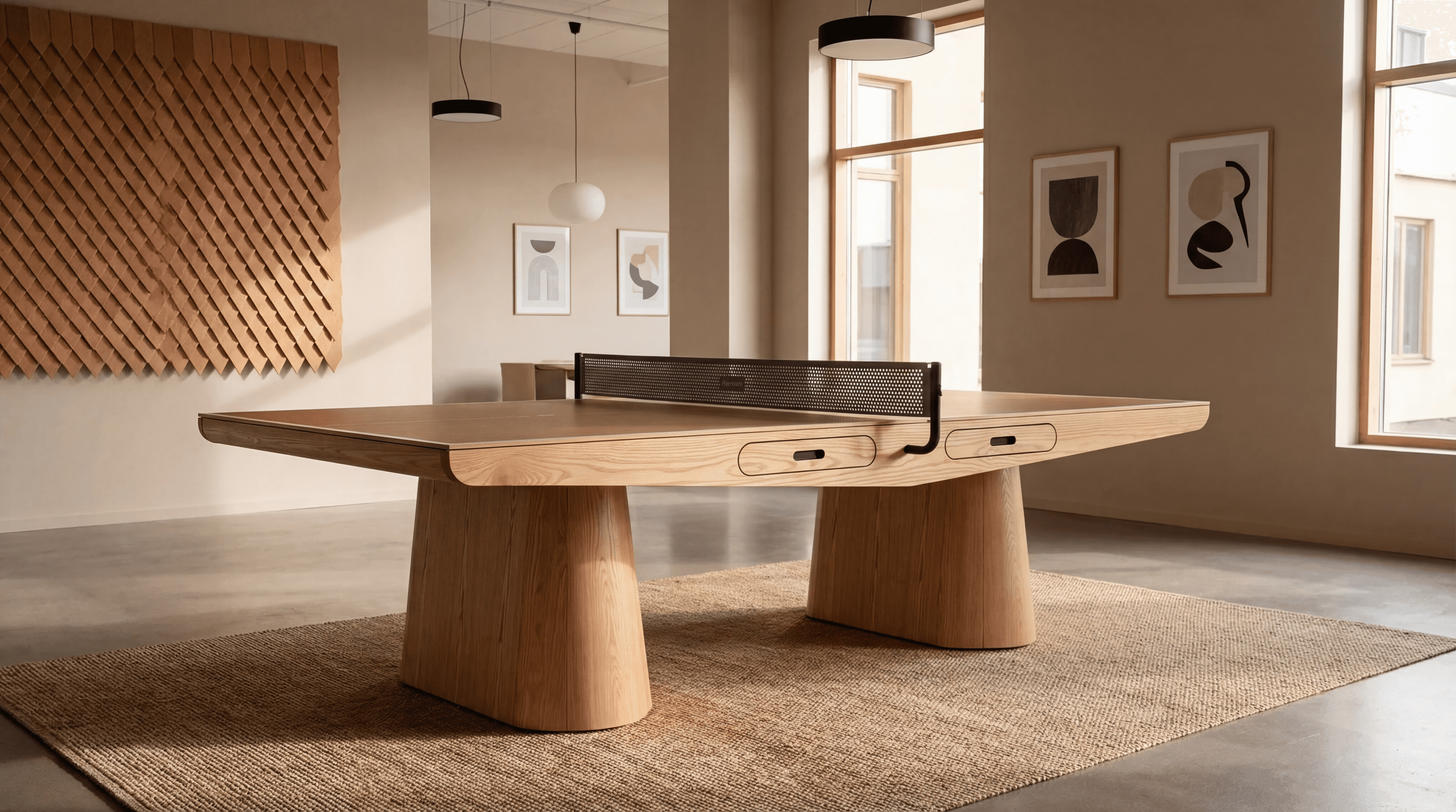
Design Shown in a Working Environment: Wiretap placed the Revel Table Tennis Table within a refined office setting, making Harrows’ original design intent immediately clear: a game table designed to coexist with work, not disrupt it.
A Calm Spatial Context That Lets the Product Lead: Warm light, architectural surfaces, and restrained styling allow the table’s form, proportions, and material quality to stand out, without overwhelming the space.
Design Intent, Made Visible: By showing the table in context, the imagery reinforces what Harrows designed from the outset: a piece that introduces play into a working environment, without taking it over.

Checklist
Neutral palette that supports, not competes with, the product
The table positioned as part of the room layout
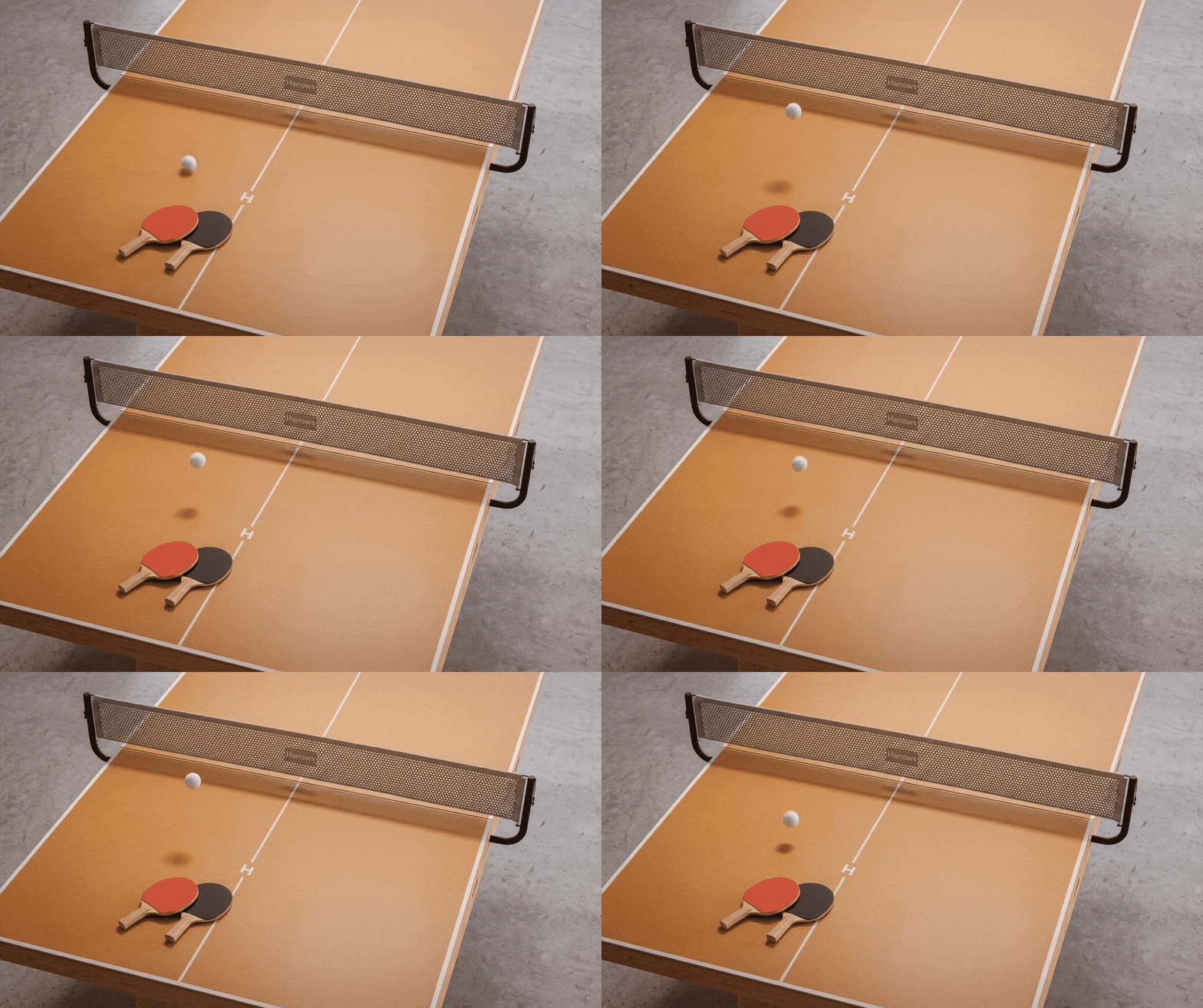
No active play, no motion-led storytelling
Clear sense of scale and proportion
Focus on form, finish, and material presence
Visual tone that feels quiet, considered, and architectural

"It looks beautiful. It looks really beautiful, and this less corporate vibe is spot on! Nailed it. Just having good content… makes our life so much easier."
Abbie Ross
Marketing Director
at
Harrows
Results
A game table that delivers performance and presence in equal measure
Reduced visual friction for design-conscious buyers
Stronger alignment with Harrows’ broader furniture language
An image that supports both product pages and brand storytelling
Conclusion
This wasn’t about making a game table look exciting. It was about making it look acceptable in a real scene. By placing Revel in a calm, believable space and stripping away visual excess, the image reframes play as something that can exist quietly alongside everyday living. The result is a product that doesn’t demand attention, yet earns it, by fitting in, not standing out.
Source: harrows.co.nz/product/revel-table-tennis

We can help you!

