Written by

Sarah Zeng
Marketing Coordinator
02 December 2025
TL;DR
Built environment teams don’t lose trust because their visuals are ugly, they lose trust because their visuals feel not for here. When a scene doesn’t match customers’ “spaces like ours” template, whether it’s a home, a workplace, a retail fit-out, or a hospitality interior, confidence drops fast. This article gives a practical framework to produce local-relevant, conversion-ready space visuals at speed, across launches, projects, and channels, without relying on one-off shoots or guessing every time.Fix the cues, and the visuals start doing their real job: reducing perceived risk, building “this belongs here” confidence, and speeding up decisions.
Ever clicked on a space or product page and thought, “Nice… but it doesn’t feel like here”? That split-second hesitation is rarely about the item itself, it’s the scene, the light, the spatial cues, the tiny details that decide whether a place feels made for your world. This article unpacks what “hyper-local” really means for built environment visuals, why it matters when you’re selling spaces (not just specs), and how to build repeatable local believability across projects, ranges, and channels.
Why does “local feel” matter more in the built environment?
Because the built environment isn’t a quick purchase, it’s a “will this work in my world” decision.
In many ecommerce categories, people can lean on specs, compatibility, or easy returns. But when you’re selling spaces (furnitures, homes, workplaces, hospitality interiors, retail fit-outs), a huge chunk of the decision is visual and emotional:
Will this look right in our kind of space
Does the material feel honest under this light
Is the scale believable, for people, for circulation, for use
Does this scene look like a real space here, or a global showroom template
And here’s the uncomfortable bit: people aren’t only judging the product, or the design, or the finish. They’re judging whether the space feels like it belongs to their world.
If the environment cues feel imported, the whole proposal starts to feel imported, even if the project is literally local.
That’s why local relevance becomes a conversion lever, not a brand nice-to-have.

So what is hyper-local content, for built environment teams?
Let’s keep this industry-specific, because “hyper-local” gets used like a buzzword and then everyone nods and… nothing changes.
For built environment teams, hyper-local content means this:
Your visuals feel like they were made for spaces here, under light here, in building types here, with people who actually live and work here.
Not “local” as in patriotic, local as in plausible.
A helpful industry definition frames hyper-local content as content tailored to a specific community’s context and needs, not just translated for it.
But here’s the built environment twist: your “context” isn’t just what you say, it’s what your images quietly prove.
So instead of thinking hyper-local as one thing, think of it as a stack of cues that work together:
Social references
This is the part people feel first.
Does the lifestyle or usage in the scene look real, how people relax, store things, move through a space, work, gather, host
Or does it look like an imported “culture script”, where the space is staged for someone else’s life rhythm
In the built environment, the space is the main character. If the life script feels foreign, the space feels foreign.
People cues
If there are people in the scene, you’re no longer showing finishes, you’re showing a world.
Do the outfits, posture, interaction feel like real life here, or ad posing
Does representation reflect the market reality naturally, not performative
Place proof
This is where space visuals get exposed fast.
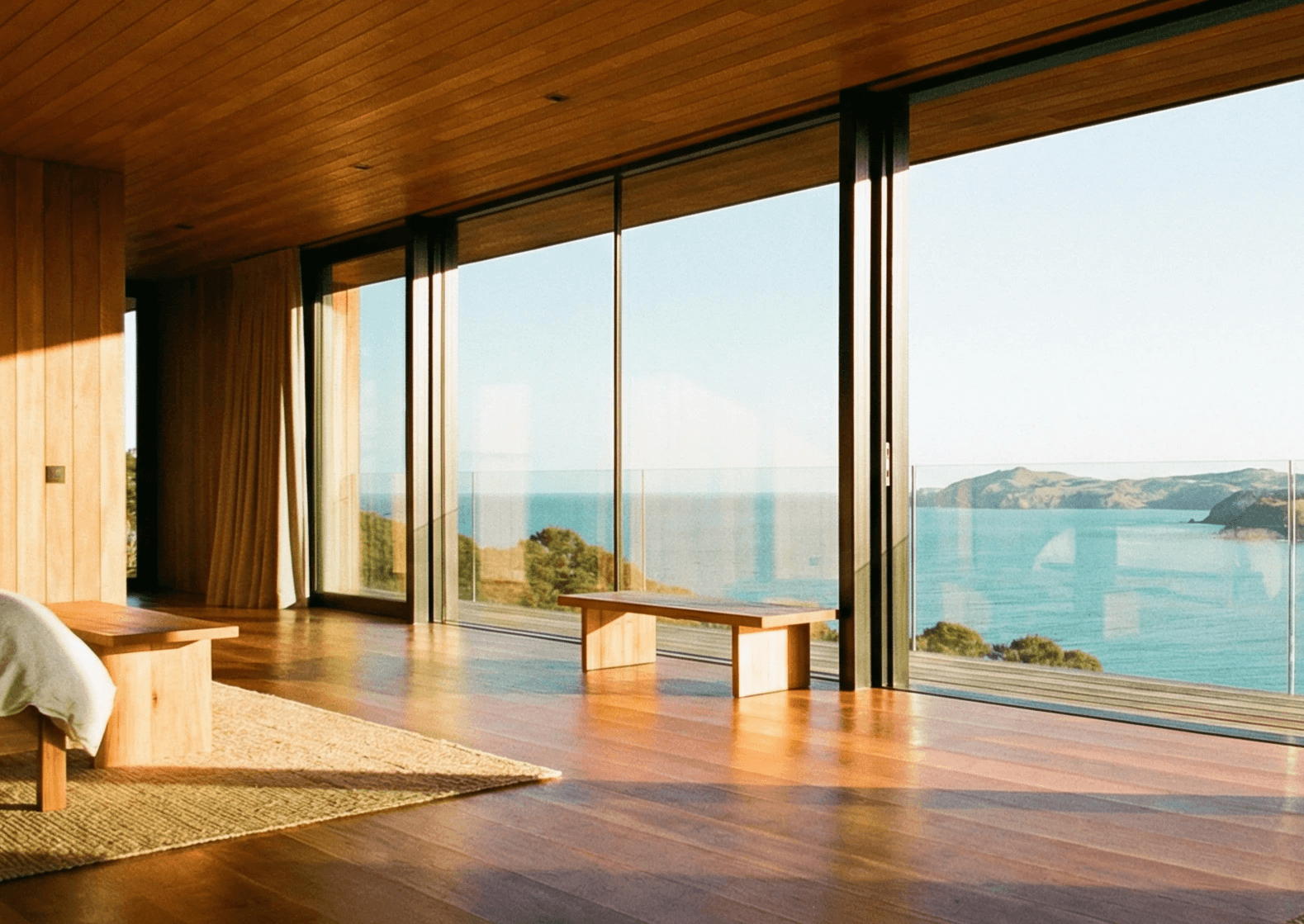
Architecture grammar
Window proportions, frames, outside views that look like local building stock
Ceiling heights, room scale, circulation that feels like real projects here, not an overseas showroom
Indoor–outdoor relationship that makes sense for the market and the climate
Floors, skirting, wall textures that sit inside the local fit-out and renovation reality
Landscape & nature cues
Plants, sky tone, the outside climate feeling match the place
No tropical plants jammed into a temperate context, the classic mismatch
Outdoor light direction and intensity make sense, because it affects interior believability
Lighting behaviour
Light that behaves like natural light in that part of the world, yes, hemisphere matters, latitude matters
No chaotic mixed colour temps
Shadows that move and change logically (especially in video), no “looks pro but feels wrong” lighting physics
Highlights that don’t plasticise materials (timber, fabric, stone, metal) and accidentally make the space feel like a different country
Local objects, but subtle
Not flags, not tourism symbols
Real lifestyle or usage objects that a person here would actually have (home, workplace, hospitality)
And they don’t steal the scene, if the prop becomes the main character, it turns into cosplay
Technical believability
Even when your scene choices are right, technical choices can ruin the whole thing.
Colour management
White balance consistent across the set (fastest way to look “mixed-market”)
Material colours believable (timber, fabric, stone, paint sit in a realistic range)
No over-grading into a “foreign studio look”
A consistent LUT / grading rule so one project/range doesn’t look like five different brands
Consistency across the set
Same product/space doesn’t look like it moved countries between shots
Same project or range keeps the same brand mood across scenes
Consistency is a trust cue in itself, inconsistency reads like uncertainty

How built environment teams accidentally make it worse?
· It’s not “translate the caption and we’re done”
Translation helps comprehension, it doesn’t fix “this doesn’t belong here.”
If the light, space logic, and environment still read as another market, the brain still hits pause.
· It’s not “swap in one local prop”
The single prop trick is how you end up with a scene that’s technically local… and emotionally weird.
If your windows, finishes, and light feel like an overseas template, adding one local object doesn’t localise it, it highlights the mismatch.
· It’s not stereotypes
Stereotypes are loud, and loud feels fake.
Hyper-local is the opposite: quiet plausibility.
· It’s not trying harder
This is the trap, people can sense performative local.
Hyper-local usually starts with subtraction: remove the cues that give away “this was built somewhere else”, then add small, real signals that belong.

Why does generic content create doubt so fast?
Because people are doing risk math in their head, even when they pretend they’re not.
They have a mental template for what spaces look like “here”, how daylight behaves, what materials look like in that light, what a plausible room feels like. When your content matches that template, it’s easy to trust. When it clashes, the brain does extra work to explain it, and that extra work feels like uncertainty.
Consumer research often discusses this under schema congruity, the idea that congruence vs mismatch changes evaluation and response.
mismatch → uncertainty → lower trust
And in the built environment, the stakes are already high, cost, timeline, disruption, reputation. You really don’t want to add “this feels imported” as bonus doubt.
The built environment version of hyper-local: what to actually build
If you want this to be repeatable, don’t aim for “a local vibe.”
Aim for a local baseline.
Build a local baseline, not a one-off vibe
The goal isn’t “make this post feel NZ-ish.” The goal is:
Make the whole visual system feel like it belongs in the market
Across launches, projects, ranges, seasons, channels
Without re-arguing taste from scratch every time
So you document your baseline like a production spec:
Typical space types you’re designing for (home, workplace, hospitality, retail)
Light moods that feel honest for the market (overcast vs hard sun, time of day)
Architecture cues to include (and cues to avoid)
Styling density rules (how lived-in / used is “real” for your audience)
People: yes/no and what “natural” looks like
A do-not-use list: the mismatches your market spots instantly
You’re not making art. You’re building a trust shortcut.
Key Takeaway
If you’re a built environment team trying to ship visuals faster without losing trust, don’t chase “more lifestyle shots”, build local believability on purpose. People decide in seconds whether a scene feels like spaces they recognise, and when it doesn’t, the brain reads it as risk.
Hyper-local content isn’t a one-off creative trick, it’s a repeatable system:
Start with subtraction: remove the cues that signal “this was built somewhere else”
Then lock a local baseline your team can brief and review against, space type, light mood, architecture cues, styling density, people approach, do-not-use list
Scale that baseline across projects and channels so your visuals stop looking globally generic and start feeling like real spaces in-market
Do this well and your imagery starts doing its real job: reducing perceived risk, building confidence, and speeding up decisions.
FAQs
How do you make visuals feel local without doing more photoshoots?
Start by removing the cues that make a scene feel imported, mixed colour temperatures, implausible window logic, unrealistic spatial proportions, overly staged styling density, and mismatched outdoor climate hints. Then document a simple local baseline your team can brief and review against: target market, space type (home, workplace, hospitality, retail), light mood (overcast/sunny/time of day), architecture cues to include and avoid, styling density, people approach, and a do-not-use list. When you standardise these inputs, you can produce local-relevant visuals faster across projects and channels without relying on one-off shoots or guessing each time.
How can built environment teams produce high-quality visuals faster for proposals, marketing, and launches?
The fastest way to ship high-quality visuals is to standardise decisions upfront, so you’re not reinventing the scene every time. Define a repeatable baseline for the market and space type (home, workplace, hospitality, retail), lock the light mood (time of day, overcast vs sunny), set architecture cues (window logic, proportions, finishes) and styling density, and keep colour management consistent across the set. If you need speed **without sacrificing local believability**, it helps to run a “second production lane” alongside traditional shoots, a streamlined way to produce scene-led, locally plausible visuals in consistent styles, fast enough for proposals and campaigns. That’s exactly the kind of workflow Wiretap is built to support: helping teams scale believable, local-relevant visuals across projects and channels with fewer bottlenecks and less rework.

We can help you!

