Written by

Sarah Zeng
Marketing Coordinator
17 December 2025
TL;DR
Schema mismatch is what happens when your visuals don’t match the viewer’s “spaces like ours” template, wrong light behaviour, window logic, proportions, materials, or outdoor cues. The result isn’t outrage, it’s hesitation, and that hesitation becomes uncertainty, which lowers trust and slows decisions. Treat local believability as a production standard: pick the market first, align the place cues and remove the mismatches before you polish anything.
You can ship a beautiful render and still lose the room. Not because it’s bad, because it’s not legible to the market you’re selling into. This post explains schema mismatch in plain language, why it shows up so often in built environment visuals, and how that tiny “feels off” moment turns into slower decisions, more objections, and less trust.
The symptom you keep seeing
In built environment marketing, rejection rarely comes as “your visuals are wrong”. It comes as the polite version: “Can we see another option?” or “Let’s wait and revisit this later” or ”It’s nice, but I’m not sure, so later.”
That’s not feedback on aesthetics. That’s signal that the viewer couldn’t place the space into their world fast enough to feel safe.
Because in spaces, uncertainty is expensive. It can stall approvals, slow proposals, create revision loops, and quietly drag conversion.

What schema mismatch actually means, in human terms
A “schema” is just a mental template.
People carry templates for what spaces look like here, how daylight behaves, what typical window shapes and proportions feel like, what materials usually look like under that light, what “lived in” means versus “staged.”
Schema mismatch is what happens when your visual cues don’t fit that template.
The brain doesn’t shout “wrong hemisphere!”
It just hesitates.
And that hesitation has a downstream effect:

In built environment marketing, trust isn’t a nice extra. It’s the gate that opens everything else, enquiries, approvals, budgets, and yes, purchases.
This is why a scene can be technically high-quality and still underperform. The craft can be strong, but the cues can be culturally and geographically unreadable.

Why this hits built environment marketing harder than most industries
Space is not a product you “try.” It’s a world you commit to.
When you’re selling furniture, interiors, fit-outs, or architectural outcomes, your customer is mentally simulating:
Will this work in our kind of building
Will this look right under our daylight
Will this feel credible in our climate and context
Will this translate from image to reality
If the scene feels imported, the simulation fails.
And here’s the twist: the more polished the mismatch, the more suspicious it can feel. A perfectly lit, perfectly staged space that doesn’t match local cues can read like a template, which increases perceived risk, not reduces it.
That’s why local believability is not “style preference.” It’s a marketing lever.
How to use this idea?
You don’t need a seminar. You need a shared language for review.
Next time a visual gets the “nice but…” reaction, don’t ask, “what don’t you like?”
Ask, “what cue is breaking the local template?”
Here are a few fast prompts your team can use in reviews:
Where is this space trying to be?
What’s the loudest mismatch cue? (light behaviour, window logic, proportions, styling density)
Does it feel like a real project here, or a reusable template?
If we fixed one cue only, which one would remove the most doubt?
When you frame feedback this way, revisions become surgical. You stop repainting the whole image and start removing the one or two cues that cause uncertainty.
That’s how you move faster and look more believable.

Example: Same set, three places, three different levels of trust
Here’s schema mismatch in the wild, using three outdoor scenes that are all “beautiful”, but they’re speaking three different local languages.
US: “sunlit backyard realism”
In the image above, you can read “America” almost instantly:bright, direct sun, a manicured lawn, palm cues, a pool edge, and a house facade that feels suburban-coastal. The default assumption here is outdoor living as extension of the home, with generous yard space and strong daylight.
If you drop in furniture visuals that carry a different light logic or a tighter, more compact spatial proportion, it won’t look “wrong”, it’ll look not from here.
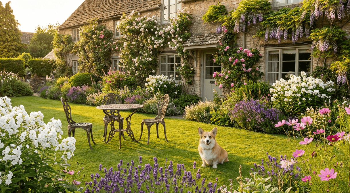
UK: “heritage garden intimacy and temperate light”
This one plays by a different set of rules: smaller scale, lush border planting, cottage-garden density, and a more intimate, lived-in outdoor moment. And it’s not just the greenery, it’s the heritage cues, the kind of space that belongs to a brick-and-chimney world, sash windows, hedgerows, soft temperate light, not a resort patio.
If you style this kind of scene too sparse, too sun-blasted, or too “poolside luxury”, it creates a quiet mismatch. Nobody will write “that’s not British”, they’ll just feel that it doesn’t belong, and that tiny disconnect is enough to slow trust.
Bali: “tropical resort cues are loud”
Bali-style contexts tend to be unmistakable: intense blue ocean line, crisp horizon, minimal modern terrace, and that high-clarity, high-sun “resort” feeling. Tropical cues are loud, which is why mismatch shows up instantly.
If your materials, shadows, or environment hints still behave like a temperate backyard or a UK garden, the brain flags it immediately, not because the image is bad, because the place logic conflicts.

Why this matters
In all three examples, the “product” could be excellent. But place cues decide whether the viewer’s brain says: this belongs here.
Schema mismatch isn’t about taste. It’s about the scene failing the local template test, and that failure turns into uncertainty, which turns into slower decisions and lower trust.
If you want one production rule:
Pick the market first, then build the scene using that market’s light, space, and outdoor-life defaults. Don’t try to “localise” at the end, it’s too late.
FAQs
What are the most common cues that make a space visual feel “not for here”?
The most common mismatch cues are usually small but loud: mixed colour temperature, daylight that doesn’t behave like the market, window logic and building proportions that don’t match local building stock, materials that read too glossy or “plastic”, styling density that feels like a global showroom, and outdoor hints, for example plants, sky, or climate, that don’t fit the place. When these cues conflict, the scene becomes hard to “place” mentally, and that friction shows up as uncertainty and lower trust.
How do you reduce schema mismatch without redoing the whole shoot or render?
Start with a “one cue fix” approach: identify the single mismatch cue causing the most doubt, whether it’s light behaviour, window logic, proportions, styling density, or outdoor hints, and correct that before making any other changes. Then lock a simple local baseline for your team, target market or city, space type, light mood, architecture cues to include or avoid, styling density, and a do-not-use list. With that baseline, you can produce locally believable variations faster across proposals and campaigns, without relying on one-off shoots or endless rework.
Where can I see Renoir’s partner profile and work examples?
For our official partner profile, you can view Renior on Teulo here → https://teulo.co/partners/renoir/ If you want to see how we think about local believability, PDP visuals, and the cues that reduce uncertainty, explore our Journal above.

We can help you!

