Written by

Sarah Zeng
Marketing Coordinator
7 Jan 2026
TL;DR
Local feel isn’t one look. It’s a set of cues people use to decide whether a space visual is believable here, across project renders, proposals, and marketing assets. Context Grammar turns that fuzzy “vibe” into a shared language built environment teams can brief, produce, and review against, Light, Space, Materials, Lifestyle, Nature. Lock a local baseline in the brief, then use a one cue fix in reviews, find the loudest mismatch and correct it first. The result is fewer revision loops, faster approvals, and locally believable visuals at scale, without relying on one off shoots for every variation.
Most teams talk about “local feel” like it’s a vibe, until the first review call turns into, “It’s nice… but it doesn’t feel like here.” The problem isn’t taste, it’s missing language. This post introduces a simple Context Grammar, Light, Space, Materials, Lifestyle, Nature, and shows how to use it as a briefing and review system, so you can ship locally believable visuals faster, with fewer revision loops and less subjective debate.
The mistake: treating “local feel” like a “style”
Most teams approach “local” the same way they approach “modern” or “minimal”: like a style choice.
That’s why feedback gets messy. You’ve probably seen this exact review moment:
Someone scrolls, pauses, and says, “It needs to feel more local.” Another person replies, “Sure… but what does that actually mean?” Then the room fills with hand-wavy adjectives, “warmer,” “cozier,” “more coastal,” “more premium,” and nobody’s wrong, but nobody’s aligned either.
And that’s the trap. “Local” becomes a vibe, not a signal. Everyone’s describing the feeling they want, but nobody can name the cue that would create it.
But local feel isn’t a style. It’s legibility.
Can someone look at a scene and instantly place it into the kind of spaces they recognise in their market?
When the answer is no, you get hesitation. Not dramatic rejection, just the slow, expensive kind. More questions, more rounds, more “let’s revisit later.”
So the goal isn’t to win an aesthetic argument.
The goal is to make “belongs here” repeatable.

Context Grammar: the five cue groups that make a space feel “here”
Think of local feel like language. A style is vocabulary, grammar is the rules that make it sound fluent.
Here’s the five-part framework you can use to brief, review, and fix scenes, without arguing taste:
Light
How daylight behaves, colour temperature, shadow softness, reflections, and whether materials read honest or “plastic.” Light is often the fastest cue your brain notices.
Space
Architecture grammar, window logic, proportions, circulation, ceiling height, density. Space is what makes a scene feel like local building stock or an overseas template.
Materials
How timber, fabric, stone, paint, metal read under the chosen light. Materials aren’t “just textures,” they’re trust signals.
Lifestyle
The usage story: how people move, gather, relax, store, work, host. Lifestyle is what makes a scene feel lived-in rather than staged.
Nature
The outdoor hints: plants, sky tone, climate cues, and outdoor light direction. Nature often “locates” the image even when you don’t intend it to.
This framework isn’t meant to be perfect. It’s meant to be shared.
Once your team can name the cue group that’s off, fixes get faster and more surgical.

Turn the grammar into a brief, so you stop guessing
If “local feel” only exists in someone’s head, you’ll keep paying for it in revisions. The fastest fix is to lock a local baseline in the brief before anyone produces a single scene. Not a long document, just the few decisions that stop a space from drifting into “global-generic.”
Market or city: where the scene is meant to belong, who it’s for, what “here” actually means.
Space type: what kind of space you’re selling, home, workplace, retail, hospitality, because each one has a different spatial logic and different expectations.
Light mood: the daylight story you’re committing to, overcast or sunny, time of day, contrast level, so the whole set reads like one real place, not a mix of lighting opinions.
Space cues: the architecture grammar that must feel plausible in-market, window logic, proportions, ceiling height, circulation, indoor–outdoor relationship.
Materials priorities: which materials must read honest, timber, fabric, stone, paint, and what must not happen, glossy plastic highlights, “too perfect” textures, colour drift.
Lifestyle density: how lived-in the scene should feel, minimal, realistic, or showroom-clean, so the usage story matches how people actually live and work in that market.
Nature cues: the outdoor hints you want the scene to carry, temperate or tropical, planting density, sky tone, outdoor brightness, because the outside often locates the image even when you don’t intend it.
Do-not-use list: the cues your market spots instantly as “not from here”, the shortcuts that trigger schema mismatch, so you can avoid them upfront instead of fixing them later.
This isn’t creative restriction, it’s creative speed. A clear baseline lets you produce variations faster, review more objectively, and fix the right cue first, without reinventing reality every time.

The review loop that cuts rework: baseline first, one cue fixes after
The most common bottleneck in visual reviews looks like this:
One person says, “It doesn’t feel local.”
Another says, “It looks fine to me.”
Then the meeting turns into a taste debate, and the output turns into endless revisions.
The fix isn’t getting everyone to agree on one aesthetic. It’s giving everyone the same reference point.
Step 1: Lock the baseline.
If the brief has market, space type, light mood, and do-not-use cues, you’re not debating taste, you’re checking alignment.
Step 2: Fix one cue, not the whole image.
Replace “I don’t like it” with one question: Which cue is breaking the baseline?
Then pick the single loudest mismatch, window logic, light behaviour, proportions, styling density, outdoor hints, and correct that first.
Don’t polish. Don’t tweak five things at once. One cue fixed well usually removes most of the doubt.
That’s the loop: baseline prevents chaos, one-cue fixes prevent spirals.
The result is faster approvals, fewer revision cycles, and visuals that stay locally believable without turning every project into a subjective argument.

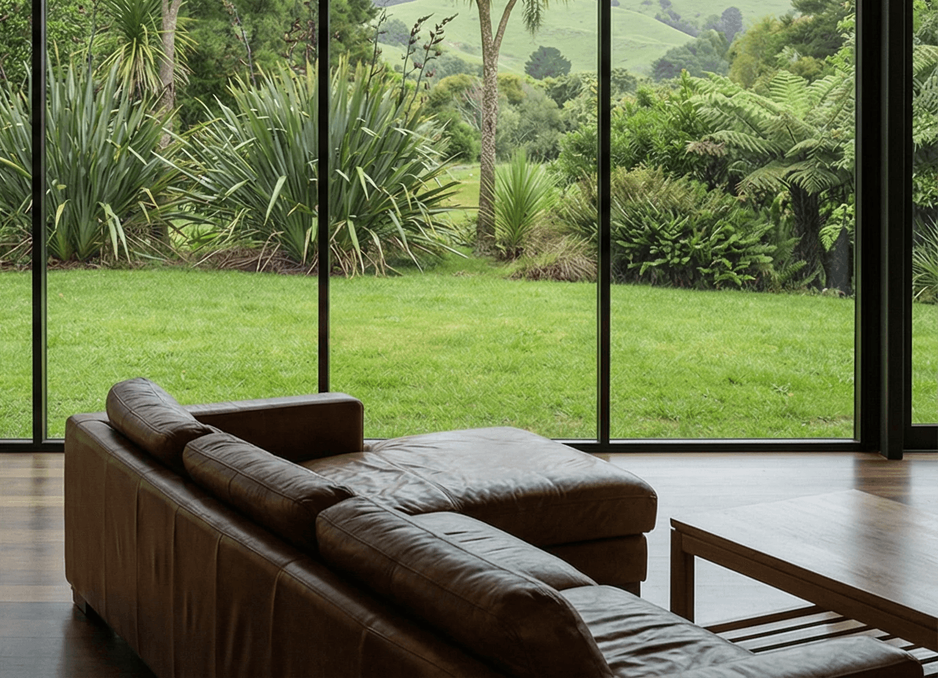
A quick example: change one cue, and the place snaps into focus
Here’s schema mismatch in the simplest form: the inside stays the same, we only change one cue, the outside world.
Same sofa, same camera angle, same interior materials, same mood. The only meaningful difference is what the glazing reveals.
On the left, the outside reads as summer-dry bushland, sun-bleached ground, open tree spacing, scrubby texture. It’s not “bad,” but for a NZ audience it can feel not from here, because it clashes with the default mental picture of NZ lifestyle and farm contexts.
On the right, that single cue suddenly makes the scene legible: cabbage tree silhouettes, flax-like clumps, ferny texture, rolling green hills. Nothing inside changed, but the space becomes readable as “NZ-ish,” and that legibility is what removes doubt.
Now imagine doing this properly across all cue groups, light, space, materials, lifestyle, nature, not just one. You’d get a near-perfect local baseline. But you don’t need perfection to get results, you need the one cue that’s currently breaking trust fixed first.
And yes, this is literally what we do. We help teams make these cue fixes fast, keep local believability consistent, and ship visuals without the slow, expensive rework.
Conclusion
Local feel is not a mood board. It’s a system.
Context Grammar gives built environment teams a shared language to brief, review, and scale visuals without falling into taste debates. Lock a local baseline up front, then fix the loudest mismatch cue first, because one cue changed well can do more than ten rounds of “make it more local.” Your output gets faster, revisions drop, and your visuals start doing their real job, making people feel, “this belongs here.”
FAQs
What’s the fastest way to make visuals feel local if you can only change one thing?
Start with Space or Light, whichever is currently the loudest mismatch. Fix window logic and proportions if the building feels “not from here,” or fix light behaviour and colour temperature if materials feel wrong or the scene reads like a studio template. One strong correction in Space or Light often removes most of the uncertainty before you touch props or styling.
How do teams scale locally believable visuals without endless back-and-forth?
They standardise the baseline and simplify the review loop. Document the market, space type, light mood, key Space cues, Materials priorities, Lifestyle density, Nature cues, and a do-not-use list. Then review with one question, “which cue is breaking the baseline?” Fix that cue first. If you need speed at scale, many teams add a second production lane alongside traditional shoots so proposals and campaigns don’t get stuck waiting on one-off production cycles.

We can help you!

